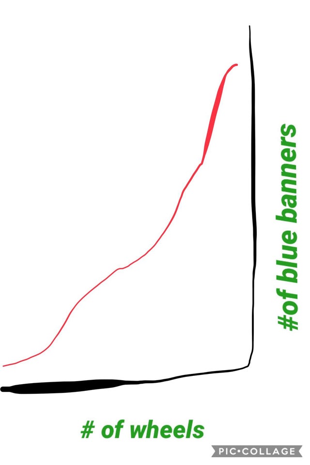
Graphing the relation between wheels and awards for FRC
AKA. Why programmer + reddit + matplotlib is a bad idea.I was scrolling through reddit the other day, and came across this great post by u/MasterQuacks.

I thought to myself “ha. Thats funny”, and moved on. But that thought had stuck with me.
So here I am, bored on a sunday afternoon, staring at the matplotlib documentation.
My creation
In only a few lines of python, I have a program that will (badly) graph the number of awards per wheel for any team, or set of teams.
As always, feel free to tinker with the code. This one is not published anywhere, so if you want to share it, I would appreciate a mention.
import requests
import matplotlib.pyplot as plt

class Team:
    def __init__(self, id, wheels):
        self.id = id
        self.wheels = wheels * 2

### CONFIG ###

teams = [Team(5024, 3), Team(254, 4), Team(1114, 3), Team(5406, 3), Team(2056, 4)]
year = 2019

##############


for i, team in enumerate(teams):
    award_data = requests.get("https://www.thebluealliance.com/api/v3/team/frc" + str(team.id) + "/awards/" + str(year), params={"X-TBA-Auth-Key": "mz0VWTNtXTDV8NNOz3dYg9fHOZw8UYek270gynLQ4v9veaaUJEPvJFCZRmte7AUN"}).json()

    awards_count = len(award_data)

    team.w2a = awards_count / team.wheels
    print(team.id, team.w2a)

    plt.bar(i + 1, team.w2a, tick_label=str(team.id))

# Plot
x_lables = [team.id for team in teams]
# plt.set_xticklabels(x_lables)

with plt.xkcd():
    plt.title('Awards per wheel')
    plt.show()
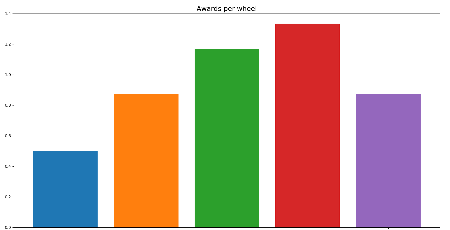
The result
Here is the resulting image. From left, to right: 5024, 254, 1114, 5406, 2056

